
Project Overview
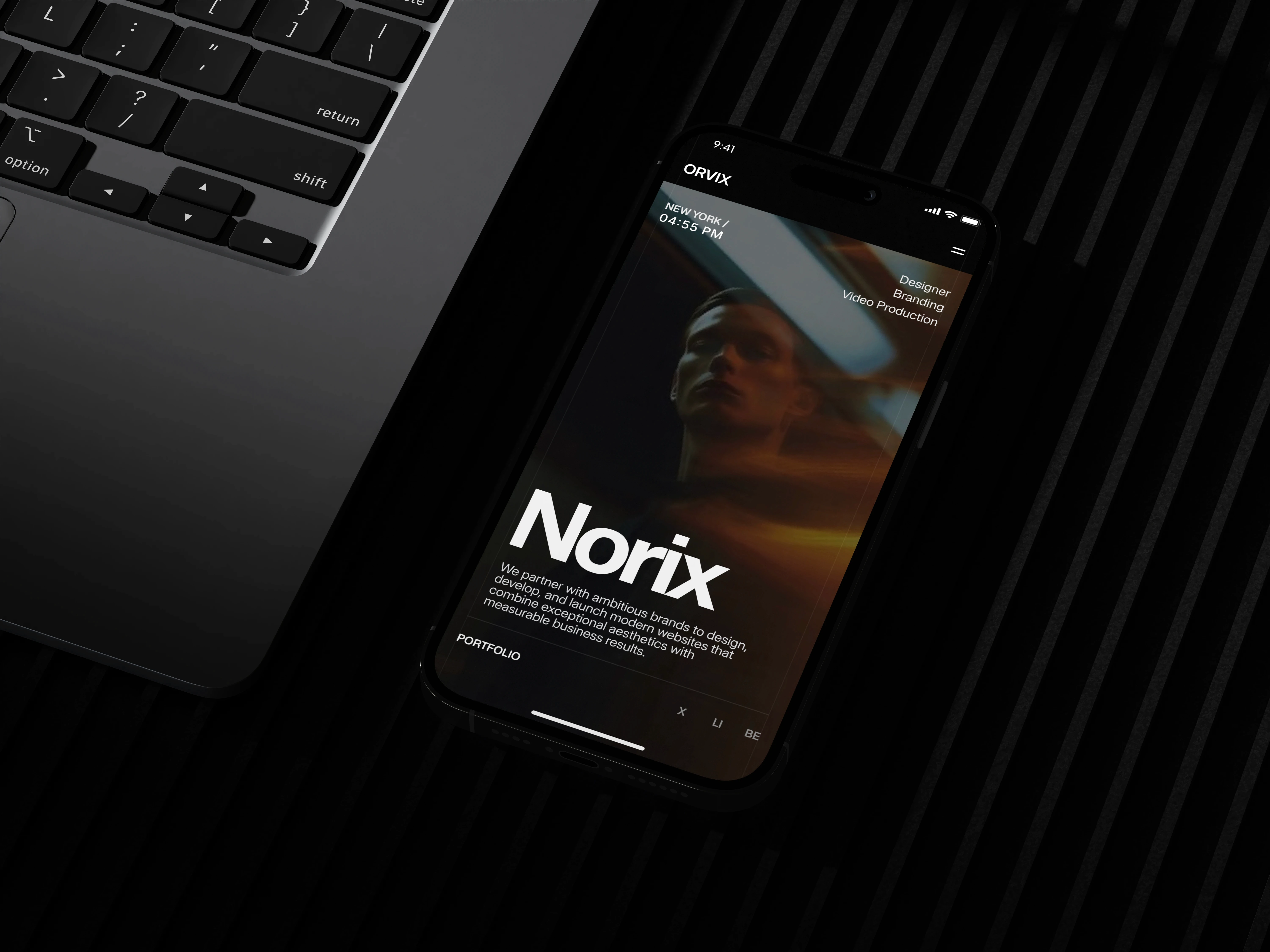
Norix is a self-initiated concept project created to explore how a modern digital agency can present its services, portfolio, and expertise through a premium web experience. The goal was to design a minimal, conversion-focused website that communicates professionalism while maintaining a clean visual hierarchy and intuitive navigation.
The website was designed with scalability in mind, allowing it to function as both a portfolio website for agencies and a marketplace-ready template. Rather than relying on excessive animations or decorative elements, the focus was placed on typography, spacing, editorial layouts, and purposeful interactions to create an elegant user experience.
Problem Statement
Many agency websites prioritize visual effects over usability. Heavy animations, inconsistent layouts, and cluttered interfaces often distract users from understanding the agency's services and value proposition. Visitors are forced to search for essential information, leading to unnecessary friction and lower engagement.
Additionally, many available templates lack flexibility for customization, making them difficult for agencies to adapt to their own branding and content.
The challenge was to create a website that feels premium without becoming visually overwhelming while remaining flexible enough for different agencies to use.

Goals
The primary objectives for this project were:
Create a premium agency experience using minimal design principles.
Improve content hierarchy to make information easy to scan.
Establish a consistent visual system built around typography and spacing.
Showcase agency services and portfolio in a structured, editorial layout.
Design reusable components suitable for Framer CMS.
Create a scalable template that could be adapted by different agencies.
Maintain excellent readability while reducing unnecessary visual clutter.
Build a responsive experience that works across desktop, tablet, and mobile devices.
Design Approach
The design process focused on simplicity and clarity rather than visual complexity.
Instead of relying on decorative graphics, the interface uses strong typography, generous whitespace, structured grids, and subtle interactions to guide attention naturally throughout the page.
Every section follows a predictable rhythm, allowing users to quickly understand the content while maintaining visual interest through carefully balanced layouts.

UX Decisions
Clear Visual Hierarchy
Large editorial headings establish clear reading order while supporting text remains concise to reduce cognitive load.
Sticky Service Interaction
The service section uses a sticky scrolling interaction where each service is introduced individually. This allows users to focus on one offering at a time rather than processing multiple cards simultaneously.
Editorial Layouts
Instead of traditional marketing blocks, the website adopts editorial-inspired layouts that emphasize storytelling and create a premium visual identity.
Consistent Spacing System
A consistent spacing scale was used throughout the interface to improve readability and create visual rhythm across all sections.
CMS-Friendly Structure
Projects and services were designed with reusable CMS fields, allowing new content to be added without redesigning layouts.
Conversion-Oriented Navigation
Primary call-to-action buttons remain consistent across pages, helping users move naturally between exploring services, viewing projects, and initiating contact.
Challenges
One of the biggest challenges was balancing minimalism with sufficient content density.
Removing too many visual elements risked making the interface feel empty, while adding excessive graphics would reduce the premium aesthetic. Achieving the right balance required careful attention to spacing, typography, and content hierarchy.
Another challenge was designing components that could function both as a polished agency website and as a reusable Framer Marketplace template.
Outcome
The final design delivers a clean and professional agency website that emphasizes usability without sacrificing visual quality. The modular component system allows content to scale efficiently, while the editorial layout creates a refined browsing experience.
Although the project is currently in progress—with additional pages such as About, Pricing, and Contact planned—the completed sections establish a strong design foundation that is suitable for both portfolio presentation and marketplace distribution.

